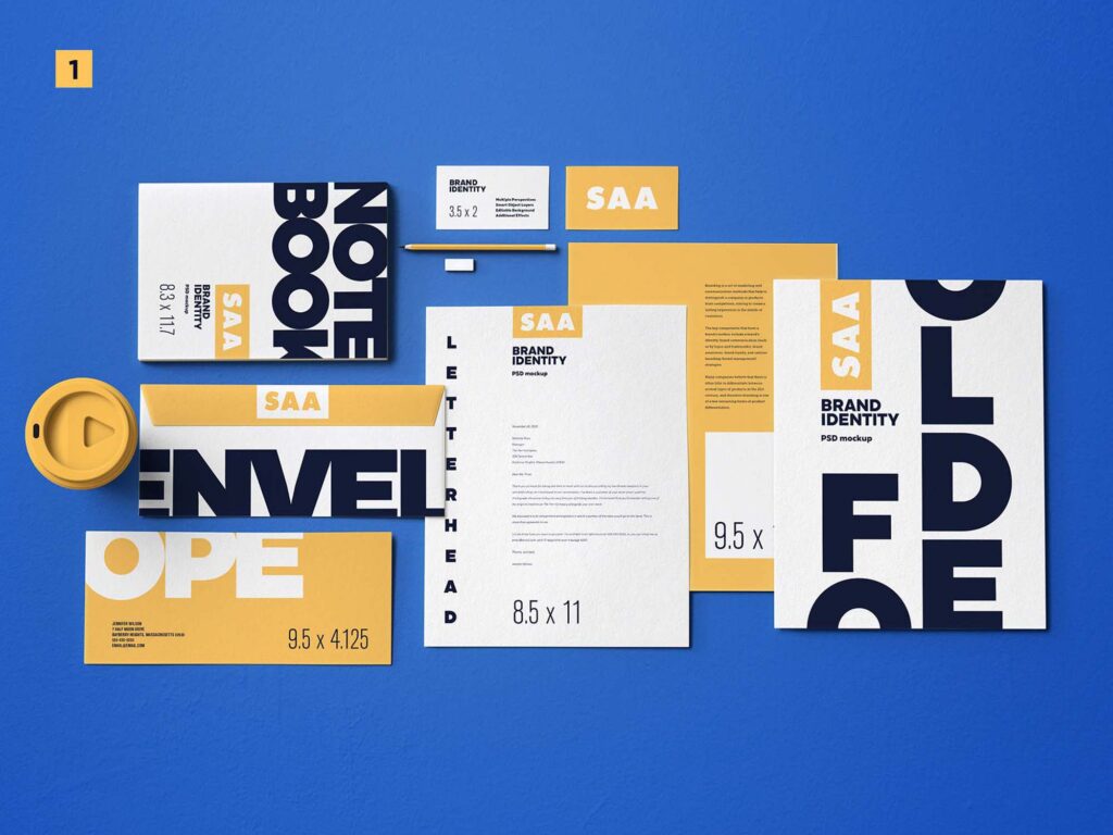
Brand kit examples are crucial for maintaining consistency across platforms through the use of logos, colors, and typography. Deloitte’s 2025 data shows that 68% of businesses believe brand consistency can boost sales by up to 20%, highlighting the urgency of using brand kits effectively.
A clean and consistent identity helps your business appear professional and develops audience trust. Moreover, visual harmony helps customers recall and identify your brand, laying the groundwork for long-term success. For that reason, being familiar with instances is crucial.
Key Takeaways:
- A strong brand identity is maintained by keeping the same colors, fonts, and images.
- A brand kit is an effective way to establish credibility and professionalism for your brand.
- Visual aspects that remain consistent make it easier to recognize things on websites, social media, and packaging.
- Using the proper typefaces and design elements makes a brand kit more effective.
Creative Brand Kit Examples To Guide Your Business
If you ask, ‘What is a brand kit?’ the answer is that a brand kit is a set of visual assets that includes an official logo, color palette, and typeface. It is a standard for how brands talk to each other. However, businesses utilize them to maintain their brand consistency across various platforms. Here are some brand kit examples for your business that may inspire your brand to stand out.
1. Google Iconic Color Identity

(Source: Wikipedia)
Google’s blue, red, yellow, and green color palette defines its identity. The logo’s sans-serif typeface gives it a contemporary look. Applications and the official website always provide this information. In this way, Google is known globally.
2. Netflix Bold Red Symbol
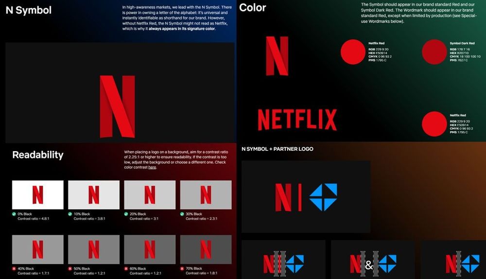
(Source: Cropink)
Netflix’s signature red “N” stands out. The iconic vertical line distinguishes the simple yet robust design. Additionally, the sign is always placed on a different background than the symbol. Netflix is globally recognized thanks to its continuous posture.
3. Yelp Cookbook Brand Guide
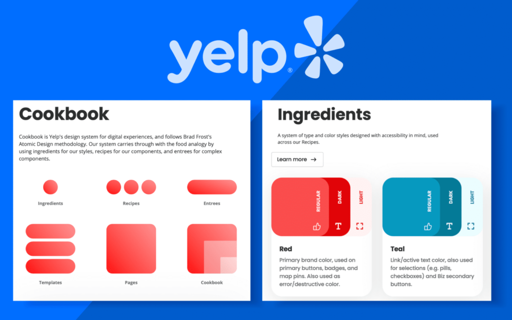
(Source: Fabrik Brands)
Yelp has ‘Cookbook as its brand guide, which highlights distinctive visual elements and how to use them in various settings and media. The red and blue color palette was combined with straightforward, easy-to-read typography.
They use the concept of food analogy to consistently present their brand identity through text, logo buttons, ratings, and notifications on the website and app. This brand guide facilitates Yelp in strengthening its brand identity and reputation across communication channels.
4. Medium Monochrome Visual Identity

(Source: Medium Design)
As part of its brand kit, Medium has a logo that serves as a visual representation of the company. The most common wordmark for web pages, banners, and picture thumbnails is black and white. Furthermore, the app, favicon, and limited space use the “M” icon. Consistently employing this logo can boost brand recognition.
5. Shopify Green Shopping Bag
(Source: Univio)
Spotify is easily recognizable by its vibrant colors and eye-catching gradients. The contemporary mood is enhanced with strong letters and unconventional forms. The website and social media consistently display these aspects. As a result, the brand image is lively and identifiable.
6. Unique Spotify Green Vibrant
(Source: Design Rush)
Spotify utilizes its distinctive green, one of the most recognizable brand colors in the digital music streaming industry. As part of inspiring brand kit examples, it also combines strong typefaces and abstract forms, creating a contemporary feel that reinforces its modern identity.
These elements are consistently displayed on the social media platforms. In doing so, the brand seems dynamic and approachable.
7. Apple Minimalist Design

(Source: 1000 Logos)
Apple appears elegant because it incorporates a lot of black and gray. Simple, basic design forms embody the essence of minimalism. Apple also has clean brand language and images that maintain consistency. These things make the brand more visible on social media.
8. Starbucks Signature Green Identity

(Source: Logo World)
Starbucks has a unique green color scheme with sophisticated color coding to stress consistency. Black and white also makes the bold impact stronger, and a bold typeface gives it more character. A consistent, friendly, and instantly identifiable brand identity is the end outcome.
9. Iconic Nike Swoosh Branding
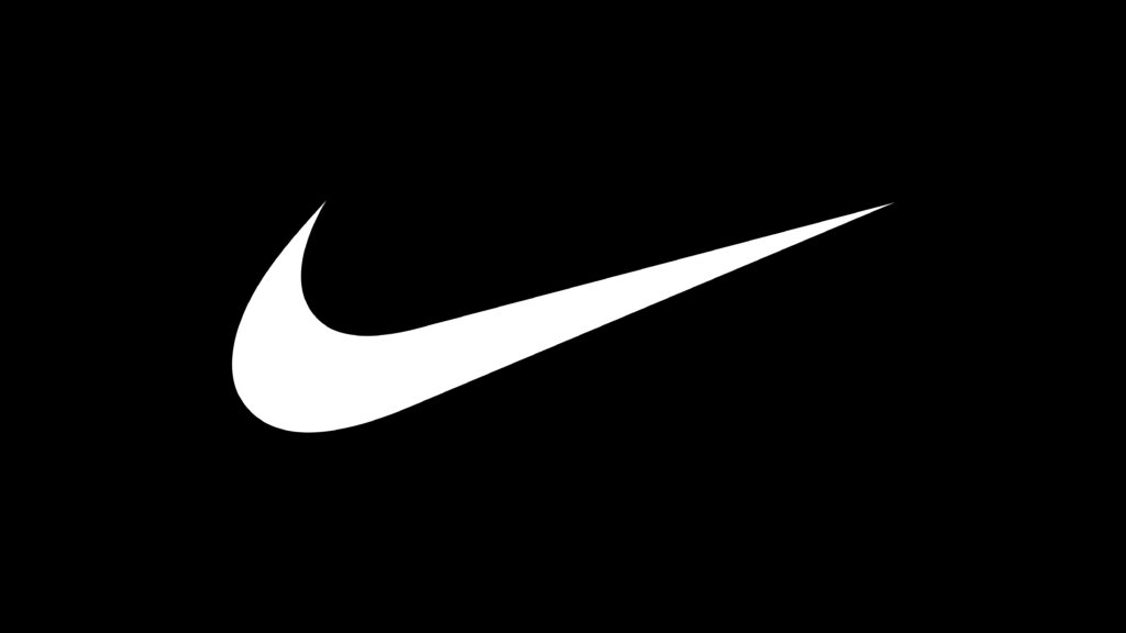
(Source: Nike)
Showcased here is Nike’s instantly recognizable Swoosh symbol, a simple but enduring design. By demonstrating how to create a brand kit with a minimalist design, Nike illustrates the power of visual symbols in making a statement.
The swoosh signifies movement and victory, reinforced through sports products and athlete campaigns on social media.
10. FedEx Professional Brand Look
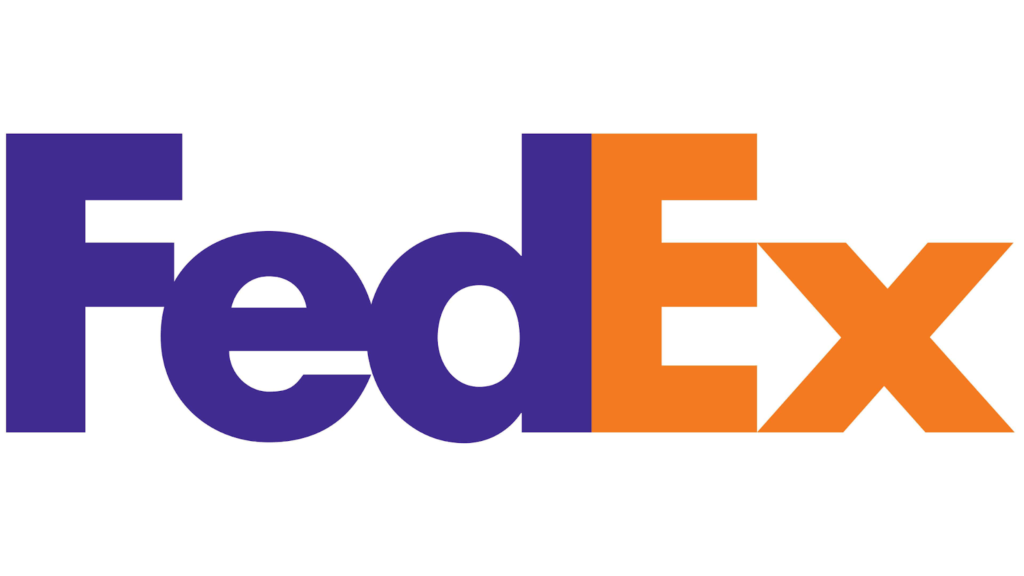
(Source: Logo.com)
The usage of FedEx’s logotype highlights font design as a significant component of the brand kit. This logotype is very stunning when paired with a basic but striking purple-orange color scheme. Consistency across its website, social media, packaging, and vehicle wraps makes the brand easily recognizable globally.
11. NASA Visual Identity Consistency
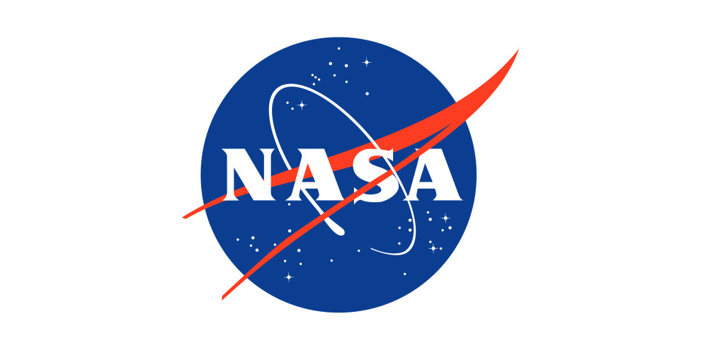
(Source: Design Rush)
NASA’s logo has bright blue and red color combinations. Modern Helvetica and traditional Garamond are examples of clean fonts that create a sense of balance and harmony. The same rules apply to all missions and on the website. By doing this, NASA’s image remains professional, strong, and easily recognizable.
Create A Unified Look Through Brand Kit Consistency
The visual elements in a brand kit, including color, typography, and imagery, serve to maintain a consistent brand identity. The list of brand kit examples illustrates the importance of those detail elements in building a strong visual identity for brands. With high-quality handmade fonts, you can create a relevant and cohesive brand kit for your brand. Explore Ghuroba Studio’s collection and get fresh inspiration to complete your brand kit and make a captivating brand identity package!
