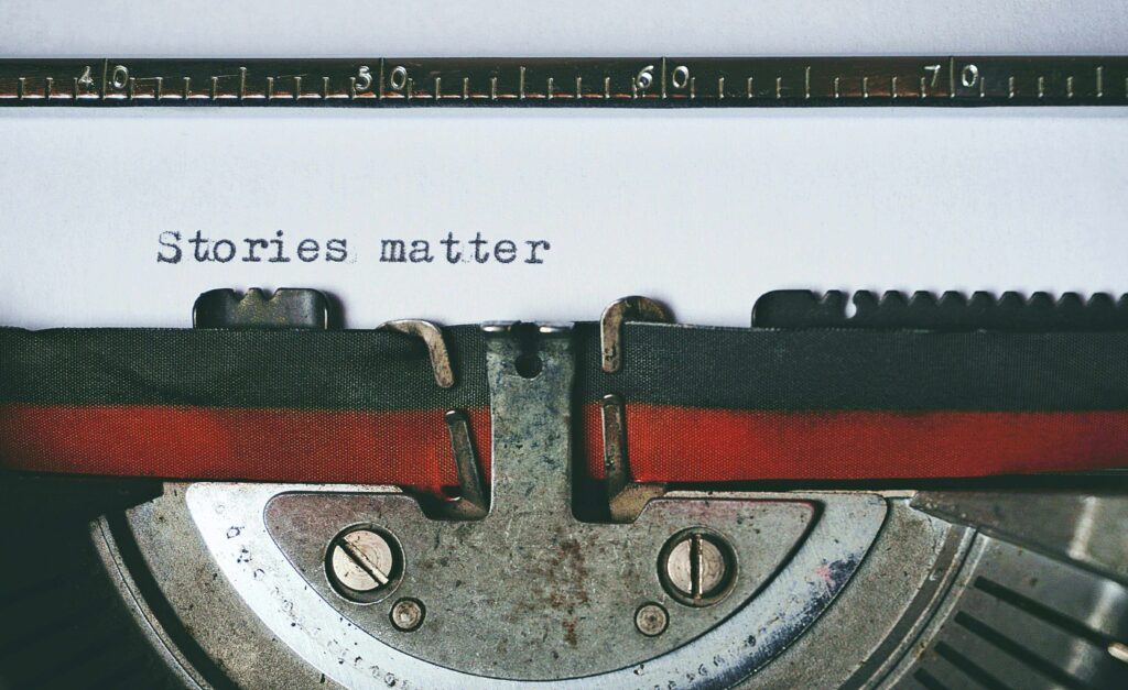
According to research published in the International Journal of Eurasia Social Sciences, typography plays a crucial role in design, enhancing text, boosting communication, and creating stronger connections with the audience.
From spacing and alignment to contrast and hierarchy, understanding these typography terms lays the foundation for creating texts that are both visually striking and easy to read.
Key takeaways:
- Typography elements such as baseline, leading, ligatures, and glyphs form the foundation of clear and visually appealing design.
- Understanding glyph variations and typeface characteristics allows designers to create more expressive and effective typographic layouts.
20 Basic Typography Terms You Should Understand
The following terms of typography are fundamental to know since they influence the typeface’s design and appearance.
1. Baseline
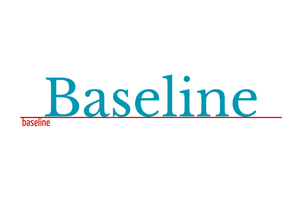
Image Source: Made in Canva
The baseline is an imaginary line where most letters rest, acting as the foundation that maintains their alignment, ensures visual harmony, and helps create consistent text flow across a design.
2. X-Height
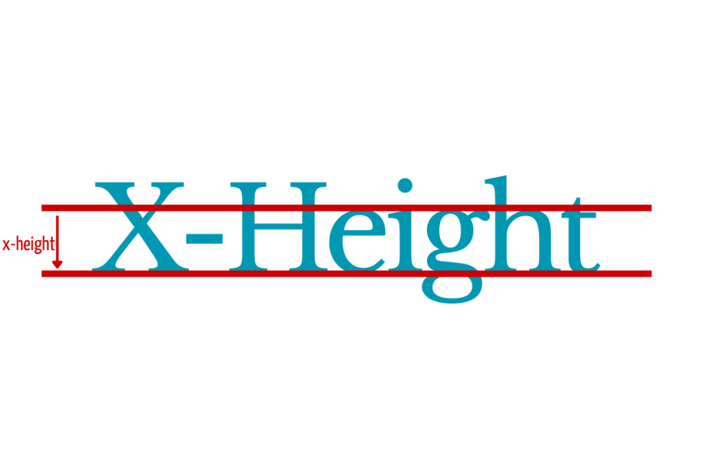
Image Source: Made in Canva
It’s the height of lowercase letters, typically measured by the height of the letter ‘x’ in a typeface. It affects a typeface’s readability and perceived size, with larger x-heights improving legibility and smaller ones offering a more refined, elegant look.
3. Ascender
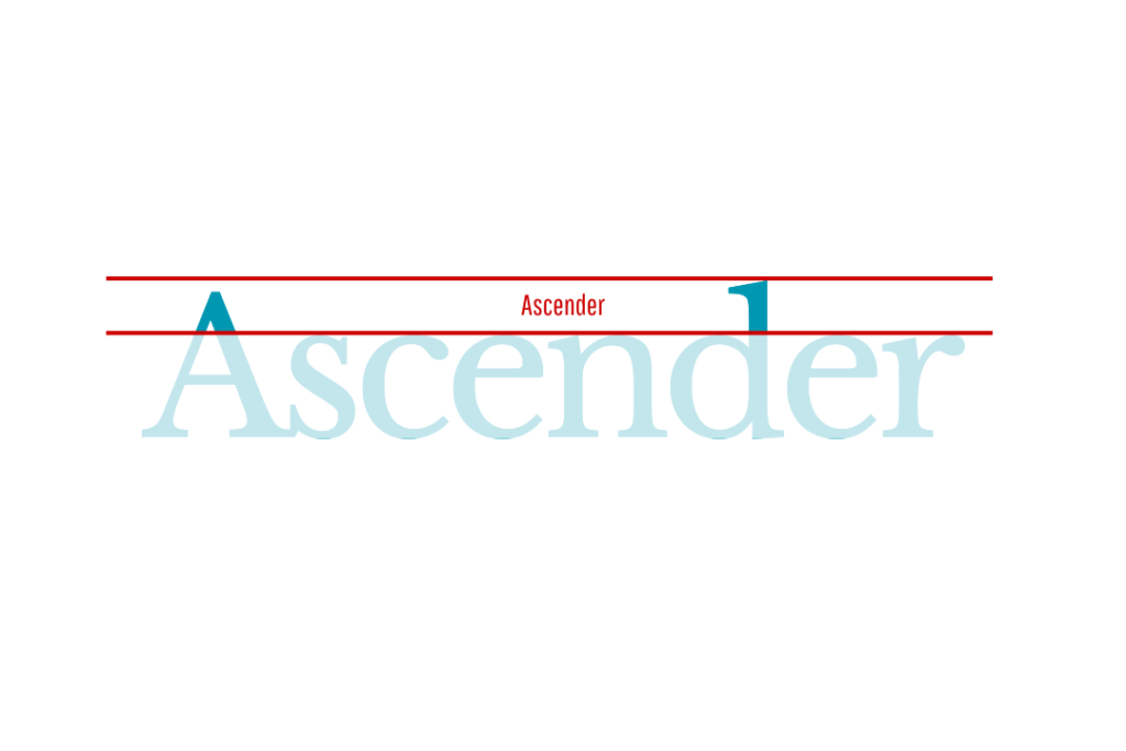
Image Source: Made in Canva
An ascender is the part of a lowercase letter that extends above the x-height to enhance readability.
4. Descender
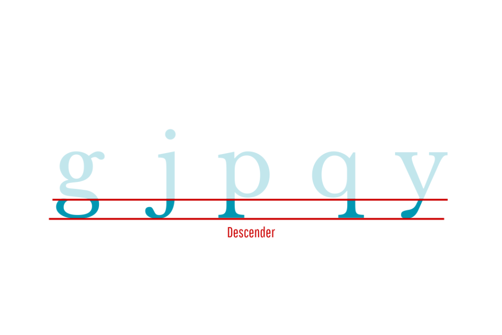
Alt text: Descender | Image Source: Made in Canva
A descender is the part of a lowercase letter that drops below the baseline, as seen in letters like ‘g’, ‘j’, ‘p’, ‘q’, and ‘y. It affects both the typeface’s legibility and its visual character.
5. Kerning
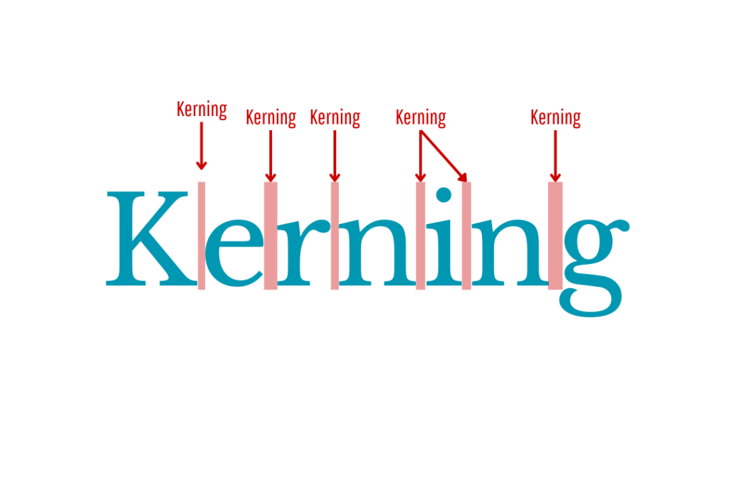
Image Source: Made in Canva
Kerning is the spacing between specific letter pairs in a word to achieve visually balanced and aesthetically pleasing text.
6. Tracking
Image Source: Made in Canva
Tracking is the uniform adjustment of space between the widest points of each character across a word, line, or paragraph, and is one of the typography spacing terms.
7. Leading
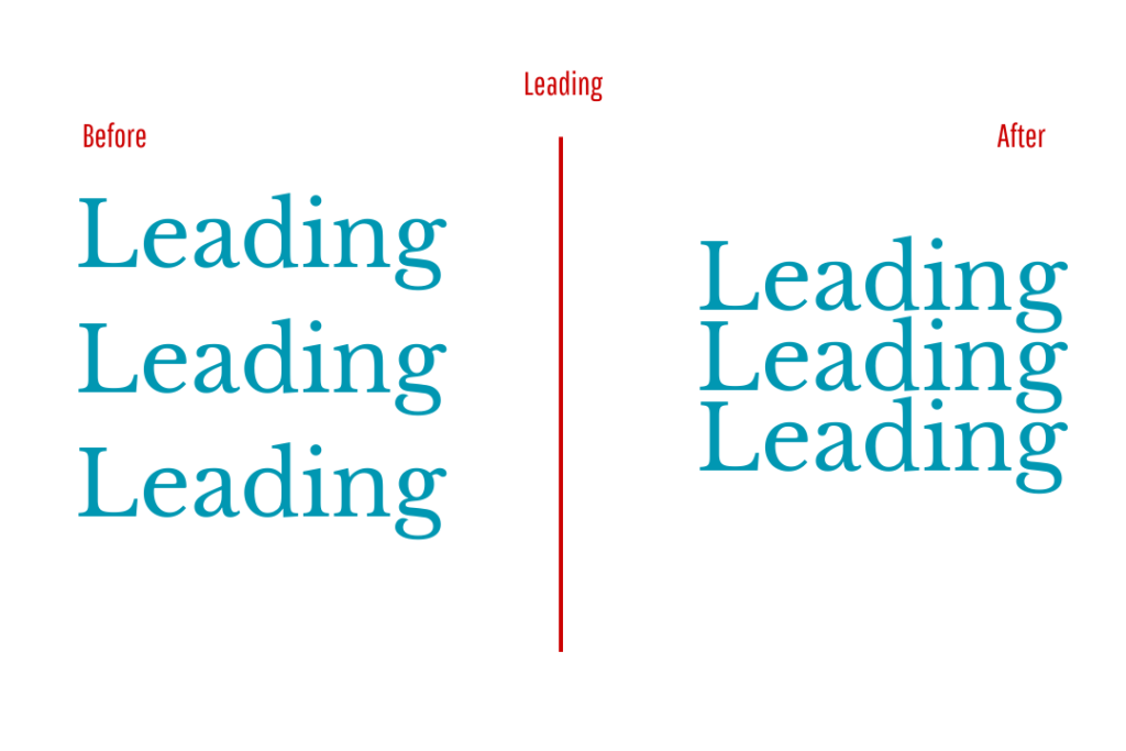
Image Source: Made in Canva
Leading refers to the vertical space between lines of text, measured from baseline to baseline, which improves readability, enhances visual flow, and creates a comfortable range for the reader’s eye.
8. Ligature
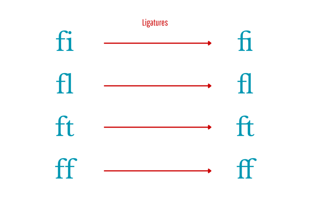
Image Source: Made in Canva
A ligature is a combination of two or more letters designed as a single unit to prevent awkward overlaps and improve visual flow, commonly seen in pairs like “fi” and “ft” in various typefaces.
9. Serif
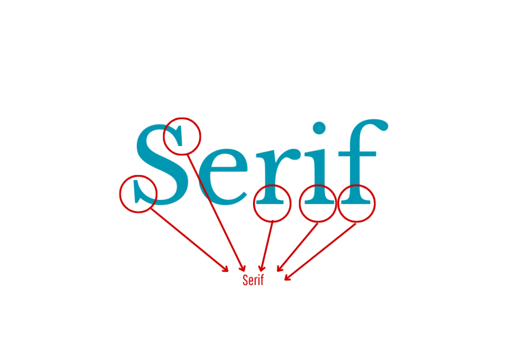
Image Source: Made in Canva
A serif is the small line or stroke extending from the ends of a letter’s main strokes, helping guide the eye and enhance readability in print.
10. Sans Serif
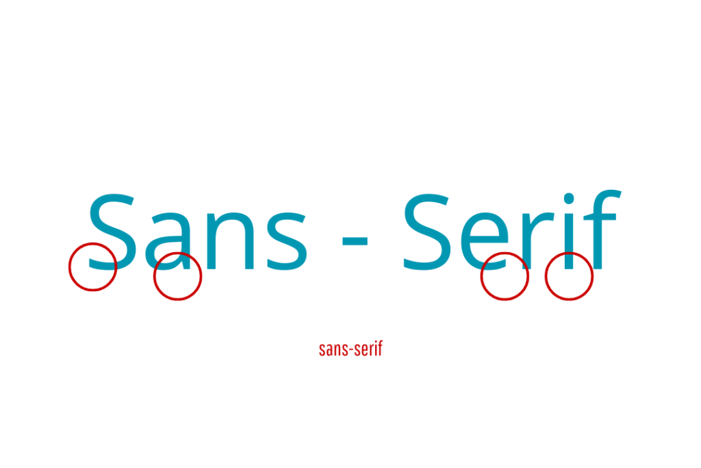
Image Source: Made in Canva
A sans serif font is a typeface without the small strokes (serifs) at the ends of letters, offering a clean, modern look with typically low or no contrast.
11. Glyph
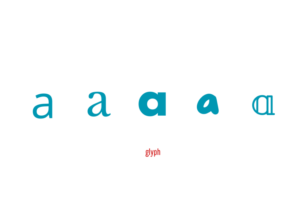
Image Source: Made in Canva
A glyph is the visual representation of a character in a specific font, including letters, numbers, punctuation, and variants like ligatures or diacritical marks. For example, the letter “a” appears in different glyph styles, such as double-storey or single-storey, depending on the typeface used.
12. Typeface
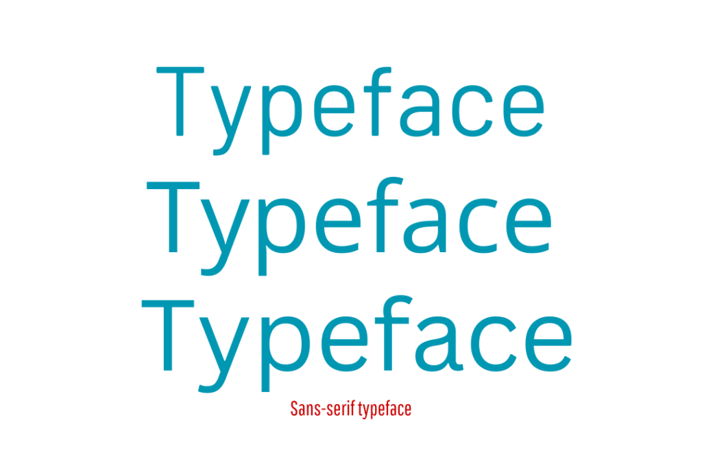
Image Source: Made in Canva
A typeface is the artistic design of a set of alphanumeric symbols, including letters, numbers, punctuation, and symbols, often across multiple languages.
13. Font
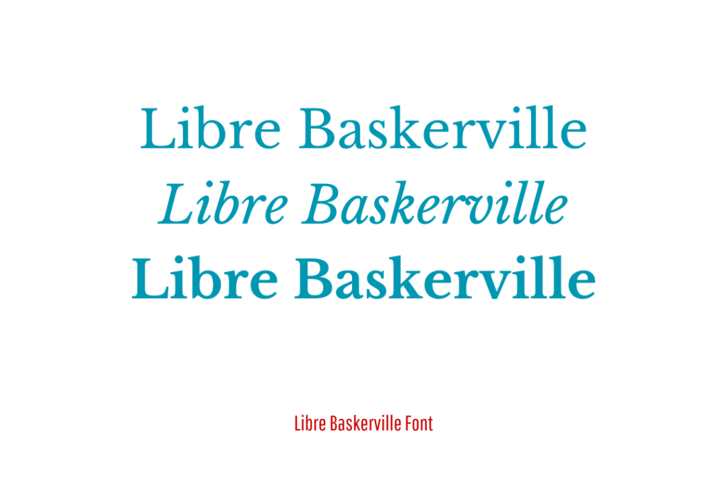
Image Source: Made in Canva
A font is a specific set of stylised characters within a typeface, defined by its size, style, and weight. For example: Libre Baskerville Medium, 50px.
14. Weight
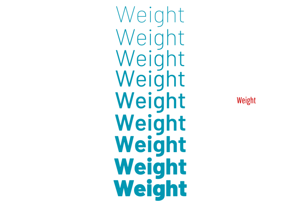
Image Source: Made in Canva
Weight specifies a character stroke’s thickness relative to its height, ranging from light (Thin or Light) to bold or heavy (Bold or Black), which influences both visual impact and readability.
15. Hierarchy
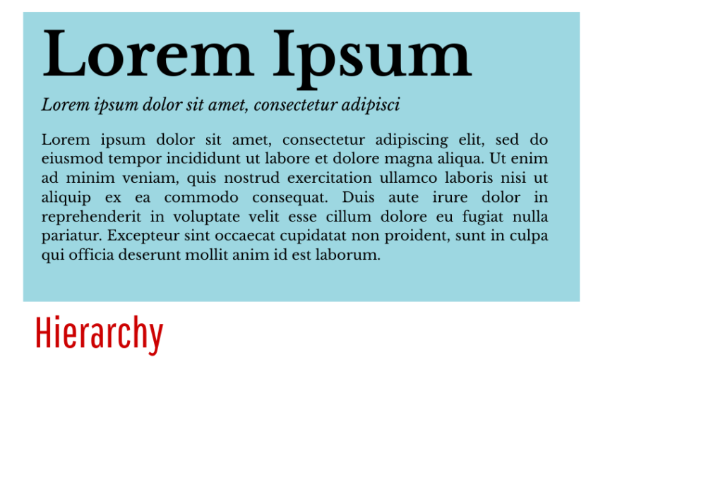
Image Source: Made in Canva
Typographic hierarchy, one of the most important graphic design typography terms, encompasses the arrangement of text to guide readers through content by emphasising levels of importance. Varied in size, weight, style, or spacing to distinguish headers, subheaders, and body text.
16. Alignment
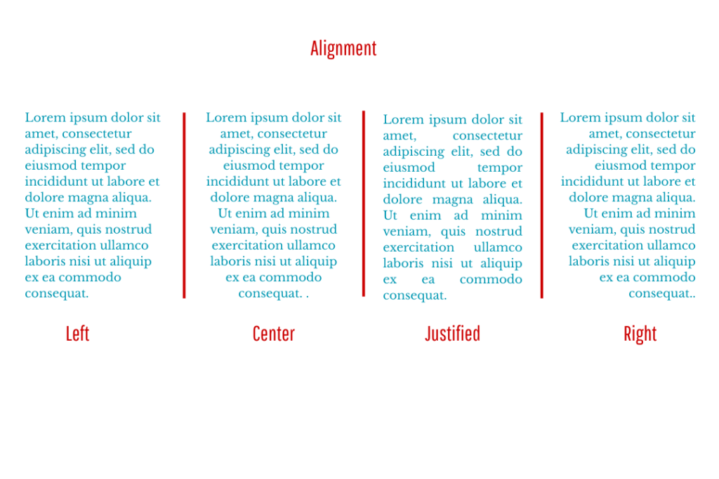
Image Source: Made in Canva
Alignment (or range) indicates text or images’ positioning relative to a page, column, table cell, or tab; divided into left, right, centred, and justified alignment.
17. Grid
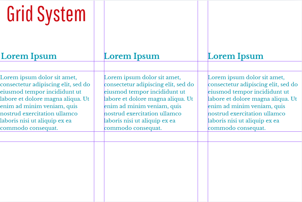
Image Source: Made in Canva
A grid is an invisible framework of horizontal and vertical lines used to structure and organise content on a page, which aligns text, images, and elements consistently. Comes in simple single-column layouts to complex multi-column systems with gutters and margins.
18. White Space
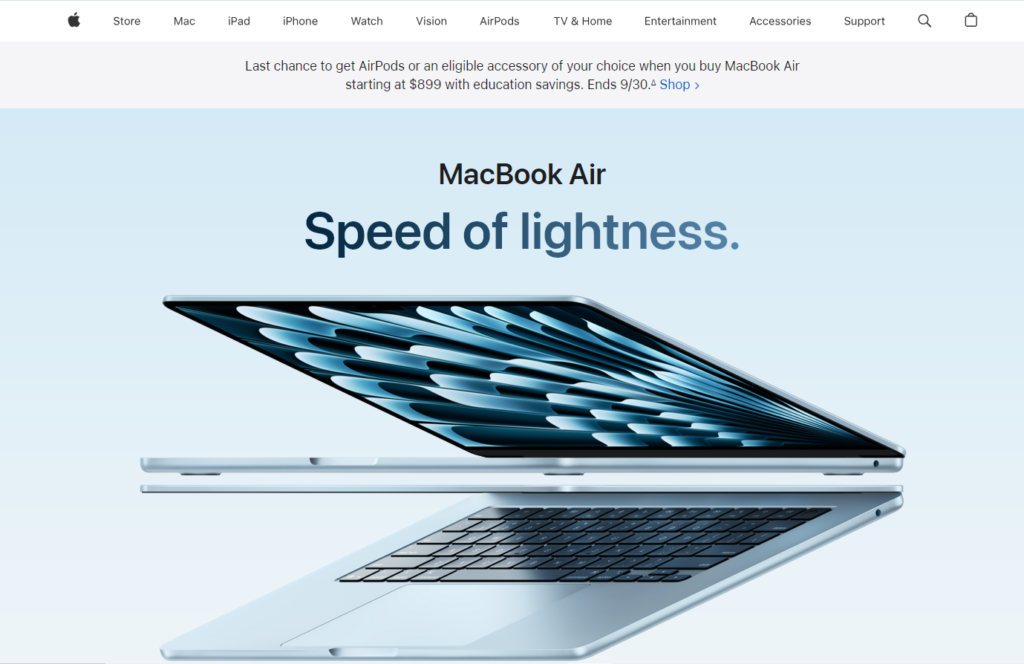
Image Source: Apple
White space (or negative space) is the area surrounding elements within a layout. It isn’t necessarily white or empty; it can have any colour, texture, or pattern.
19. Contrast
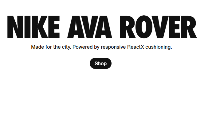
Image Source: Nike
Contrast refers to the variation of features, such as weight, size, and style, within a typeface. This emphasizes key elements, creates visual interest, and guides the reader’s focus toward important information in the text.
20. Readability
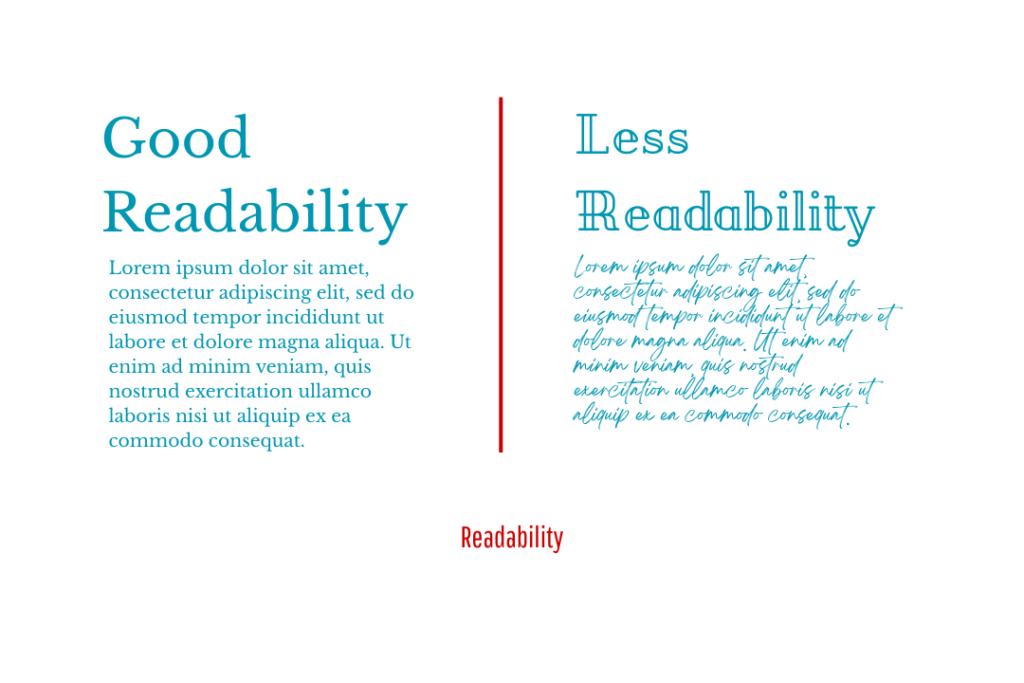
Image Source: Made in Canva
Readability refers to the ease with which text can be read and understood, which depends on typography, layout, spacing, and contrast, all working together to improve legibility and enhance the comprehension of the content.
Why You Should Know about Typography Terms
Knowing about these technical terms allows you to choose and arrange your typefaces and create interactive and professional designs. They also favor clear, balanced, and engaging content for your audience. Once you understand them better, you can properly choose an exclusive font collection to make your designs stand out with style and professionalism. Visit the Ghuroba Studio website and get yours now.