Understanding graphic design principles in the beginning is like finding the North Star; it sets the direction so your creative work doesn’t drift aimlessly. These principles aren’t just aesthetic rules; they ground your designs with clarity and meaning.
Nielsen Norman Group explains that visually appealing designs lead users to perceive an interface as more usable and even forgive minor flaws, this is known as the “aesthetic-usability effect”. If you want to create visuals that look great and communicate effectively, keep reading!
Key Takeaways:
- Understand core graphic design principles to create clear and engaging visuals.
- Principles such as balance, contrast, emphasis, hierarchy, and alignment enhance communication and visual impact.
- Applying these principles effectively ensures designs are both attractive and functional.
The 10 Basic Principles of Graphic Design
To understand how great visuals are made, let’s explore the ten fundamental graphic design principles that every designer should know.
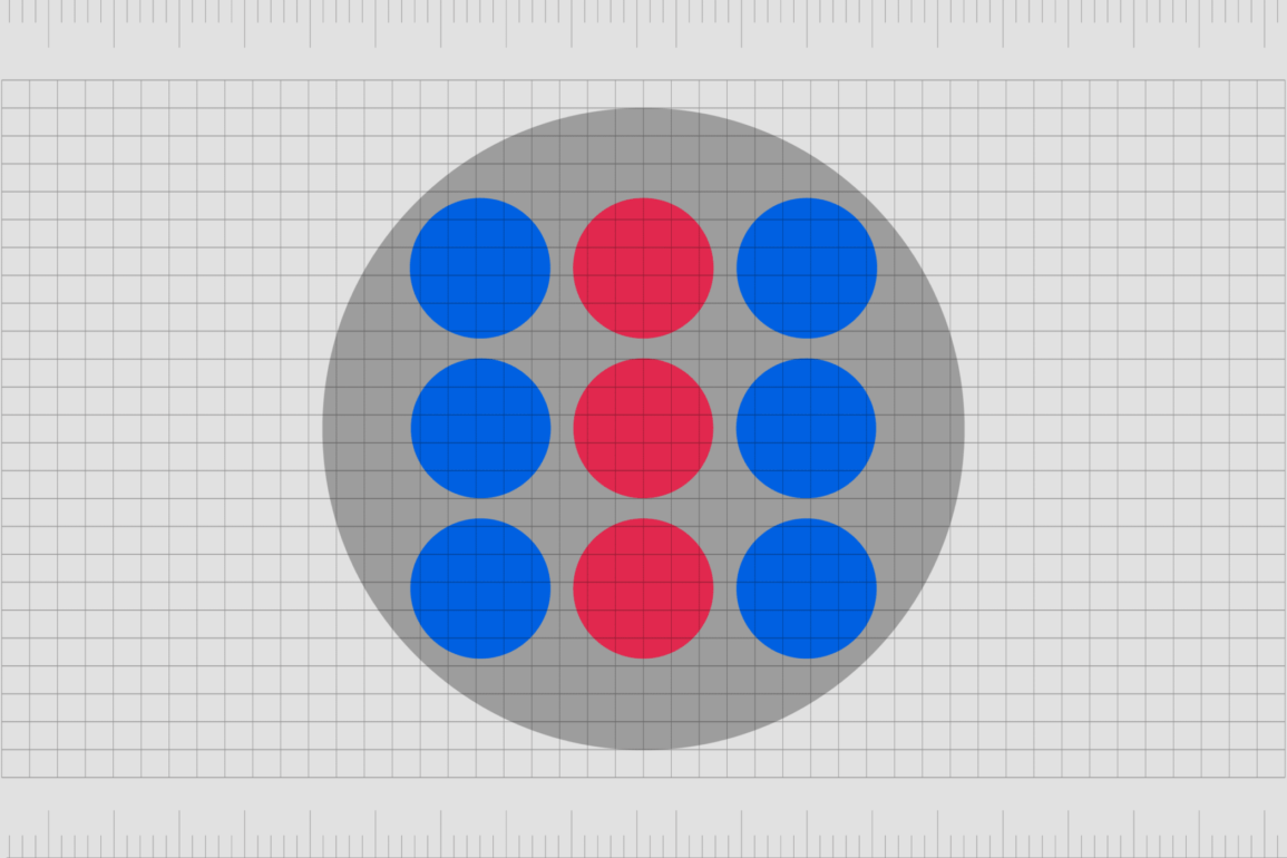
1. Balance
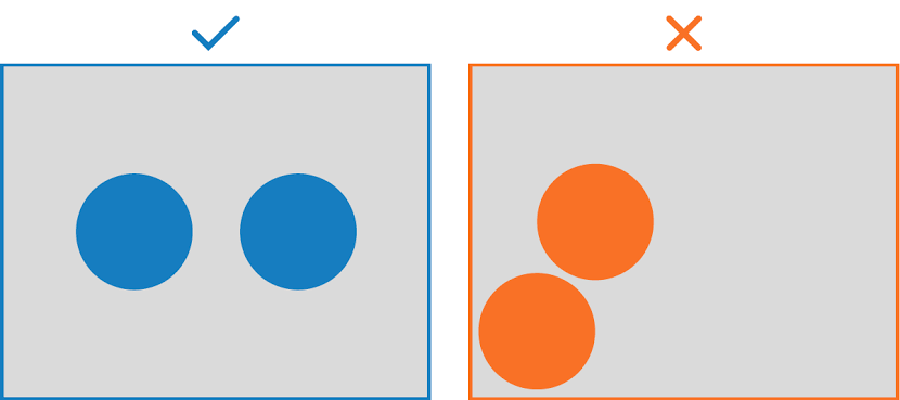
Source: propiar.com
Think of balance as the backbone of any design. It’s one of those principles that makes everything feel right, nothing too heavy on one side, nothing too empty on the other.
Whether you use a symmetrical setup, play with asymmetry, or go for a radial style, balance gives your design a sense of stability. That’s why websites, posters, and branding instantly look more polished and trustworthy when balance is in place.
2. Contrast
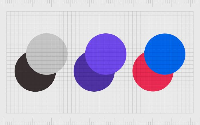
Source: fabrikbrands.com
When we talk about principles of graphic design, contrast is one you can’t ignore. It’s all about creating differences, light against dark, big next to small, or bold beside thin. Contrast keeps your design lively, makes text easier to read, and instantly draws the eye to what matters most, like a headline or that “Buy Now” button.
3. Emphasis
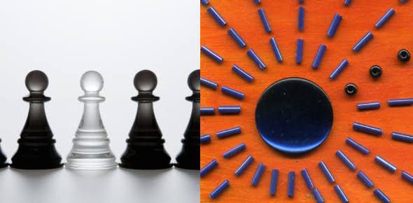
Source: proprofs.com
Emphasis is basically about saying, “Hey, look here first!” in your design. It’s the trick designers use to guide the eye straight to the most important part. You can achieve it with bold colors, larger sizes, or simply by placing an element in the right spot.
Think of an ad where the discount text pops out or the product photo instantly grabs you, that’s emphasis doing its job.
4. Hierarchy
Source: visme.co
Hierarchy is like giving your design a roadmap. It tells people, “Start here, then move there,” so they don’t get lost in the details. Bigger text, bold fonts, or placing something right where the eye naturally lands can instantly show what’s most important.
That’s why you see it everywhere, from websites and brochures to infographics, helping people catch the main message without any confusion.
5. Alignment
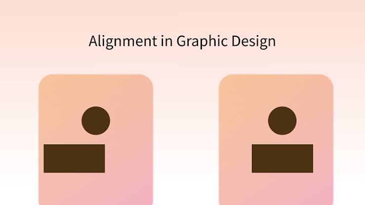
Source: pixso.net
Among the many graphic design principles, alignment might seem simple, but it makes a huge difference. It’s what keeps everything in order, text, images, and shapes, so your design looks neat instead of messy.
Whether you line things up to the left, right, center, or justify them, good alignment instantly makes logos, packaging, or layouts look more polished and professional.
6. Repetition
Source: fabrikbrands.com
Repetition is what ties a brand together and makes it unforgettable. By reusing the same colors, fonts, or shapes, your audience starts to recognize your style instantly, almost like a signature.
This is why brand identities and even simple social media templates rely heavily on repetition: it creates rhythm, consistency, and trust in every design you share.
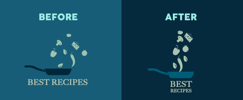
7. Proportion
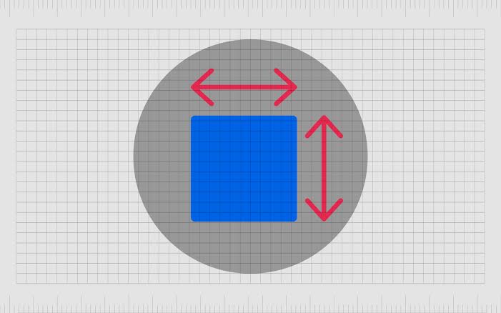
Source: fabrikbrands.com
Proportion is basically how the size of one element relates to another. Get it right, and your design feels balanced and harmonious; get it wrong, and things start to look a bit off.
Designers often use tricks like the golden ratio to nail the perfect proportions, which is why you’ll see it applied in posters, packaging, and even product design to make everything look “just right.”
8. Movement
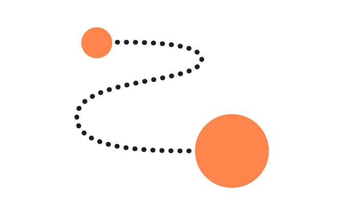
Source: app.uxcel.com
Among the 10 design principles in graphic design, movement is what brings your work to life. It’s not about animation, but about guiding the eye so viewers know exactly where to look first and where to go next.
By using lines, curves, or strategic placement of elements, you can create a smooth flow that makes a landing page, poster, or digital ad feel dynamic and engaging.
9. White Space
Source: artworkabode.com
White space, or negative space, is simply the blank area around your design elements. But don’t think of it as wasted space; it actually makes your design easier to read and more visually appealing.
By giving text and images some room to breathe, you create layouts that feel modern, clean, and professional. That’s why white space is a favorite in web design, social media posts, and sleek branding.
10. Unity
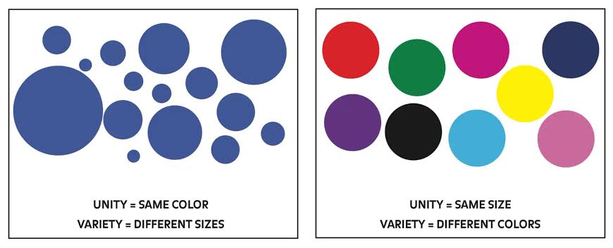
Source: logo.com
Unity is what makes a design feel whole. It’s the principle that pulls colors, fonts, and styles together so everything looks like it truly belongs.
When unity is present, your work feels consistent, intentional, and powerful, whether it’s a multi-page layout, a brand identity, or a full campaign. Without it, even the most creative ideas can feel scattered.
Bringing Design Principles into Practice
At the heart of every impactful visual lies strong graphic design principles. They act as the foundation that ensures your work isn’t just attractive, but also meaningful and professional. Whether you’re designing for brands, digital media, or personal projects, applying these principles will help your message stand out. To sharpen your skills further, mastering these fundamentals can transform your creative process. And if you want your designs to truly shine, don’t miss the unique fonts at Ghuroba Studio. With distinctive and beautiful typeface collections, adding character and personality to any project is no longer impossible.